
Power Of Colour: How It Can Impact Your Restaurant
Let’s state the facts, first: there is definitely power in colour.
Whether you want to believe in its spiritual aspect or its more realistic approach, the fact of the matter is simple: colours have an impact strong enough to make us happy or sad, excited or agitated – and can even affect our hunger.
Yes, even hunger – and restaurants can learn to taken advantage of this.
You’ve seen how every restaurant – whether its fine dining or fast food – has their own specific colour scheme they follow. Well, we’ll tell you that it’s not just an aesthetic choice; it’s got a lot more to do with how their chosen set of colours affect people’s moods and appetite.
The three main kinds of colour schemes you’ll find in most restaurants are as follows:
Warm, Earthy tones
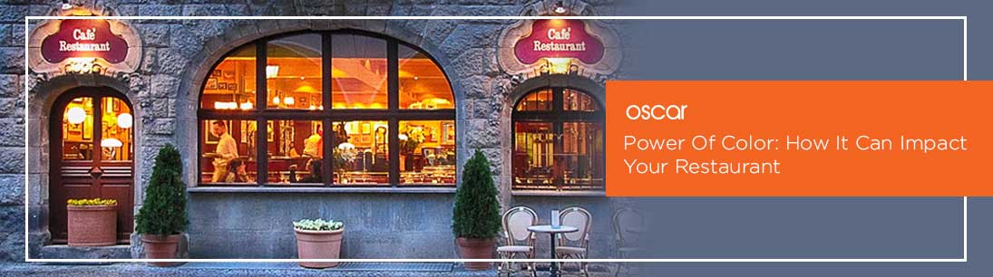
Warm tones like maroon, green, warm orange and brown give off a feeling of relaxation, which the customers catch almost instantly. Simultaneously, they also boost a person’s appetite, and radiate a welcoming aura. This not only makes customers eat more, but also makes them want to stay around for longer periods of time. This works exceptionally well for fine-dining restaurants and cafes with multiple courses being ordered.
Light Colours
Now, we’re talking about light colours: white, pale yellow, beige, lavender, and the like. These colors make even small rooms look bigger. Plus, because of their lightness, they induce a relaxed, comfortable feeling in people almost instantly. For these reasons, this colour scheme works wonders for bistros and smaller cafes who want their customers to feel at peace with their ambience.
Loud & Bright
This is the exact opposite of the previous colour scheme. Now, we’re talking about obnoxiously bright colours like red, yellow, orange, the works. Although irritating to look at for long periods of time, the colours do invoke a feeling of excitement in people – their blood pressure and heart rate increase, which makes them eat and leave quickly. That’s the kind of magic big fast-food chains like KFC and McDonald’s use!
With so many kinds of colour schemes laid out in front of you, you may be wondering, “Now what do I pick?”
For that, you will first need to know your own requirements – what is it that your restaurant wants to achieve? And what does it want out of its consumers?
For example, if you want a high turnover rate for your QSR (Quick-Service Restaurant), then you’ll want your customers to eat and leave at a fast rate – for that, bright colours work best. On the other hand, if you want your customers to spend more time (and more money), then you can go for earthy warm tones. If you’re stuck with a small store, then light colour schemes help make your layout look a lot more spacious.
Of course, there are a lot more ways to improve your store’s ambience. Nowadays in Pakistan, restaurant owners have begun introducing tablet-based POS terminals. One such POS terminal in Pakistan is Oscar POS; it has gained popularity for being a seamless system with great management systems integrated within one platform – inventory management, CRM System, accounting system are just to name a few. On the plus side, it’s sleek, touch screen is capable of giving any restaurant a modern flair.
The perfect way to end this article is by saying one thing: your restaurant’s interior matters as much as the food you serve.


