
Love your Layout! Create the Best Retail Store Design
Running a retail store is a lot more than just setting up your products on shelves and expecting customers to come in to make purchases. It requires a lot of planning and attention to detail – including the layout of your store.
A retail store layout is the use of your store’s space to influence the customer experience. The smart way of doing so requires you to focus on two key areas:
- Store Design – this is the use of floor plans and space, which includes furniture, lighting, displays etc.
- Customer Flow – this is the pattern of customer behaviour and the way you want your customer to navigate through your store.
Both go hand-in-hand when you have to create an optimised floor plan for your retail store. Here are some tips that will help you out.
Decide what kind of floor plan you want to use
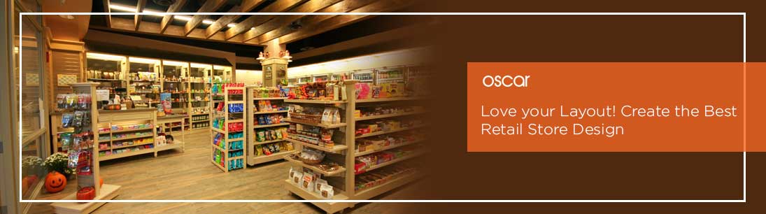
Whether it’s a retail giant or a humble store, owners always pick one of four commonly used store layouts:
Grid:
This is a layout that most of all convenience stores, pharmacies, and superstores use. It maximises the use of flooring and space and is all about the product. Products are placed in a predictable pattern of aisles for the customer to grab and go. It looks like this:
Since it offers a “grab-and-go” experience, it works well for small stores that shelf-stock their inventory like toys, books, kitchenware and the like. However, if your aim is a little higher in terms of a branded environment, relaxing browsing and an interactive customer experience, then this might not be the best option.
Herringbone:
This is similar to the grid layout but works best for stores that have a lot of product but minimal space. It has “side roads” that display products on shelves:

This holds the benefit that it can display more products in a limited space. The central path can be adjusted to give customers comfort; bookstores place sofas for people to use while they browse their favourite books. However, the same thing has its downside; the hidden aisles increase chances of theft and can be cramped for too many customers to use at the same time.
Loop:
This kind of layout acts as a “racetrack” with a single path for all customers to use, to browse products places on the wall and the central part of the store. It looks like this:

This layout helps give a guided experience for the customer, who gets a chance to browse every item on display. It is hence one of the more popular and effective layouts for smaller and larger retail shops. But it lacks in giving customers the freedom of choice; they have to browse through products they don’t need to find the one they want, creating a sense of wastage of time in their minds.
Free flow:
A free flow is just as the name suggests – it is free in terms of design and layout of furniture, shelves etc. It gives the owner the chance to creatively design their own customer pathway and their own layout of products. An example is as shown:
Perhaps this liberty is what most retail store owners are looking for. Hence it happens to be a favourite among shop owners, especially ones with smaller storage space. However, planning your own layout can be risky, because you have to deal with the consequences yourself. This kind of layout should be picked only if you are skilled – or bold – enough!
Identify customer flow
After you have decided what layout to use, you need to see how you want your products placed. For that, you need to see what your customers want.
Customer flow patterns depend on the type of store, its size, and the target customer. One of the most effective methods for understanding your existing customer flow and identifying potential opportunities is by using an analytics software. Video cameras can help you see which parts of your store are crowded, and which are empty.
While you plan your customer flow, you need to make sure customers get personal space as they shop. Nobody wants to bump into others while browsing your store!
A good point of sale software like Oscar POS lets you analyse which products are selling best, so that you can place them in more visually appealing parts of your store, like speed bumps. These are outposts or sections that place popular or limited edition products in an eye-catching way, to attract customers. This slows customer flow and contributes a lot to retention and a good impression.
You’re not just limited to using your floor – you can even optimise wall space. Power walls are identifying features of your store, where customers are first drawn towards. These are almost always promotional and set the customer’s mood upon entering. There are no limits about how you should create power walls, but there are certain tips that are worth following:
- Power walls should define your brand – use a colour scheme, lighting or display styles that suit the overall aesthetic of your store. Whether you want a bright outlook or a darker vibe, it must be in sync with your store’s entire concept.
- They can promote either your logo, catchphrase, or even your popular products. This can work if you have limited space, and want your store to have its own speed bumps or attraction sites
- Be creative, but do not be obtrusive! Give enough personal space to the customers.
Allison Walzer, Sr. Retail Channel Marketing Manager at Microsoft sums up the basis of a good store layout with a great phrase: “Create walkways to guide the purchase journey with easy way-finding.”
Therefore, after you make the decision of setting up your own retail store, spend ample time focusing on planning a layout that suits your available space, customer flow and the outlook of your store.


